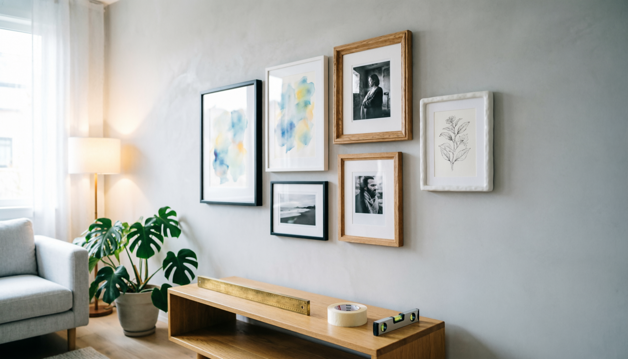
A gallery wall can make a room feel layered, lived-in, and visually complete. Most people overcomplicate the process with rulers, laser levels, and exact spacing charts.
Good gallery walls rely more on visual rhythm than math. Balance comes from shape distribution, frame scale, negative space, and consistent visual weight across the wall.
Aesthetic Design Protocol
A balanced gallery wall requires controlled visual weight, consistent spacing by eye, and a dominant focal frame positioned slightly off-center for a natural flow.
Maintain 2-to-4-inch spacing between pieces, anchor the arrangement at seated eye level, and distribute dark frames evenly. Oversized gaps or clustered heavy artwork create visual drift and weaken wall cohesion.
Comparison Table
| Layout Element | Visual Outcome | Wall Balance | Styling Flexibility | Long-Term Appeal |
|---|---|---|---|---|
| Symmetrical Grid | Clean and formal appearance | Strong structure | Low flexibility | Timeless |
| Organic Cluster Layout | Relaxed and layered feel | Medium structure | High flexibility | Modern and adaptable |
| Linear Salon Arrangement | Elongated visual movement | Strong horizontal flow | Medium flexibility | Works well in hallways |
How to Create a Balanced Gallery Wall without Measuring
From Floor Layout to Wall Execution
Start on the floor, not the wall. Lay out all frames in the desired arrangement. This gives a full view without strain and helps avoid awkward spacing later.
Keep edges aligned loosely, not rigidly. Walls shift perception, so a layout that feels slightly uneven on the floor often looks balanced once hung.
Trace each frame onto kraft paper. Label each piece so it matches the correct frame. Cut carefully, but perfection is not necessary.
Tape each template to the wall using painter’s tape. Step back often. Small adjustments make a big difference once everything is mounted.
Use a pencil to mark nail points directly on the paper. This avoids measuring errors. Hammer nails through the paper, then tear it away.
Frames go up exactly where planned, no second-guessing.
Tools that make this easier:
Painter’s tape – holds paper templates in place without damaging paint.
Kraft paper roll – used to trace and test layouts on the wall
Picture hanging strips – good for lightweight frames, no nails needed.
Laser level – keeps rows straight across wide walls.
Picture hanging kit – includes nails, hooks, and anchors for different weights
Start with One Anchor Piece
Every balanced gallery wall needs a visual anchor. This piece acts as the center of gravity for the arrangement. Large artwork, mirrors, clocks, or bold typography prints work well.
Place the anchor slightly off-center instead of directly in the middle. Perfect centering often feels stiff in casual living spaces. Slight asymmetry creates movement and keeps the wall from appearing overly staged.
Dining rooms benefit from horizontal anchors. Staircases usually work better with vertical pieces that follow the upward line of the steps.
Sofas and console tables pair well with medium-to-large rectangular frames.
Avoid starting with the smallest frame. Small pieces force unnecessary expansion and usually create uneven spacing later.
Use the Floor First
Floor layouts prevent unnecessary wall damage and reduce placement mistakes. Arrange all artwork on the floor before hanging anything.
Keep frame spacing visually consistent instead of mathematically perfect. Human eyes naturally tolerate slight differences when the overall rhythm feels cohesive.
A few practical rules help maintain balance:
- Place heavier or darker frames across multiple areas instead of clustering them together
- Mix frame sizes gradually instead of placing tiny frames beside oversized artwork
- Keep landscape and portrait orientations evenly distributed
- Leave breathing room around standout pieces
- Repeat colors or materials at least three times across the arrangement
Tape outlines rarely help in real homes because furniture, lighting, and shadows change wall perception once pieces are mounted.
Build Around Visual Weight Instead of Measurements
Visual weight matters more than exact spacing. Large black frames feel heavier than thin oak frames even when dimensions match.
Gallery walls fail when one side appears visually dense while the other side feels empty. Correcting this issue does not require measurements. It requires redistribution.
Several elements increase visual weight:
- Dark frame finishes
- Thick mats
- High-contrast artwork
- Oversized pieces
- Ornate frame profiles
- Deep shadow-box designs
Balance heavy frames with lighter pieces nearby. Spread bold artwork across the wall instead of stacking everything on one side.
Rooms with low ceilings benefit from vertical movement. Taller frame groupings naturally draw the eyes upward and prevent compressed-looking walls.
Create Consistent Spacing by Eye
Perfectly identical spacing often looks cold. Slight variation feels more natural and lived-in.
Most balanced gallery walls maintain roughly two to four inches between frames. Wider gaps disconnect the collection. Tight spacing creates clutter.
Use hand-width spacing for easier placement:
- Two fingers for compact gallery walls
- Palm width for medium spacing
- Full hand width for oversized arrangements
This method creates consistency without constant measuring.
Corners usually need slightly more breathing room than center sections. Crowded edges make gallery walls feel boxed in and visually cramped.
Mix Frame Styles Carefully
Mixed frames create depth when handled correctly. Too many unrelated finishes create visual chaos.
Strong combinations include:
- Black frames with natural oak
- Brass accents with cream mats
- Thin modern frames beside one ornate statement piece
- White frames mixed with textured wood
Limit the palette to two or three finishes. More than that weakens cohesion.
Gallery walls also benefit from repeated shapes. If circular art appears once, repeat curved forms elsewhere through mirrors, sconces, or rounded frames.
Use Furniture as a Visual Anchor
Floating gallery walls often feel disconnected from the room. Furniture underneath creates grounding and proportion.
Sofas, sideboards, benches, and desks help establish visual structure. The gallery wall should generally span about two-thirds the width of the furniture beneath it.
Tiny gallery walls above oversized furniture appear unfinished. Oversized gallery walls above narrow furniture feel top-heavy.
Maintain roughly six to ten inches between furniture and the lowest frame edge. Less space creates crowding. Excessive space breaks connection.
Expert Opinion
Expert’s Tip: Command strips work well for lightweight templates during layout planning, but permanent hanging requires proper anchors. Gallery walls shift over time when frames rely only on adhesive support.
Heavy frames need drywall anchors or stud-mounted hardware to maintain alignment and prevent gradual tilting across the arrangement.
Common Gallery Wall Mistakes
Hanging Everything Too High
Most gallery walls sit too close to the ceiling. Artwork should visually connect to furniture and eye level.
The center area of the arrangement should generally align around seated eye height in living spaces.
Tall ceilings do not require excessively high placement. Empty wall space above the gallery wall often looks more balanced than excessive elevation.
Using Frames That Are Too Small
Tiny artwork scattered across a large wall creates visual noise instead of impact.
Larger frames usually improve balance immediately. Empty matting also helps smaller artwork hold more presence without adding clutter.
Ignoring Negative Space
Every inch of wall space does not need decoration. Negative space allows artwork to breathe and prevents visual exhaustion.
Balanced gallery walls contain intentional pauses between clusters.
Matching Everything Perfectly
Perfect symmetry can flatten personality. Real homes benefit from variation, texture, and slight irregularity.
A balanced wall should feel collected over time rather than assembled from a catalog page.
Adjust After Hanging
Even carefully planned gallery walls may need adjustment after installation. Lighting changes perspective throughout the day.
Step back frequently during installation. Check balance from multiple angles and seating positions.
Minor repositioning often improves flow more than starting over entirely.
Good gallery walls evolve naturally. Swapping pieces seasonally or adding travel art over time keeps the arrangement personal and visually layered.
FAQs
1. How much spacing should remain between gallery wall frames?
Most balanced gallery walls work best with two to four inches between frames. Smaller gaps create cohesion. Larger gaps separate artwork too aggressively and weaken the visual connection between pieces.
2. Should matching frames always be used?
No. Matching frames create a formal appearance, but mixed finishes often feel warmer and more layered. Limit combinations to two or three materials or colors to maintain cohesion.
3. What is the biggest gallery wall mistake?
Hanging artwork too high causes the most problems. Gallery walls should visually connect to nearby furniture and remain close to natural eye level instead of drifting toward the ceiling.
Final Take
Balanced gallery walls rely on rhythm, proportion, and visual weight rather than strict measurements.
Strong layouts begin with one anchor piece, maintain consistent spacing by eye, and distribute heavier artwork evenly across the wall.
Rooms feel calmer and more intentional when negative space, frame scale, and furniture alignment work together instead of competing for attention.