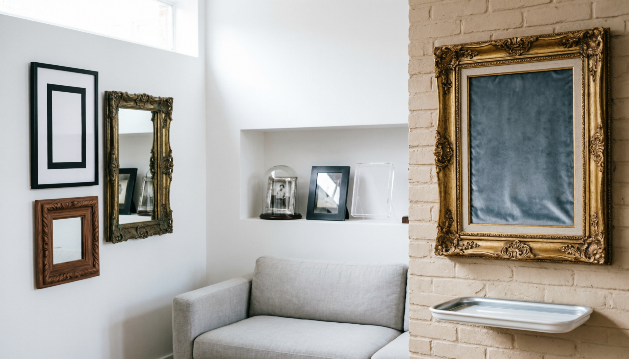
Sharp black metal frames beside aged brass portraits can either feel intentional or completely chaotic.
The difference comes down to scale, spacing, finish balance, and visual rhythm. A well-curated wall mixes clean modern lines with vintage character without creating clutter or forcing perfect symmetry.
Spatial Logic Summary: Successful frame mixing requires one dominant visual thread such as color, matting, or wood tone.
Maintain 2- to 3-inch spacing between frames and anchor large vintage pieces with clean modern shapes nearby. Uneven visual weight causes gallery walls to feel crowded, unstable, and visually noisy.
Comparison Table
| Attribute | Modern Frames | Vintage Frames | Mixed Curated Result |
|---|---|---|---|
| Visual Weight | Clean and minimal | Ornate and textured | Balanced contrast with depth |
| Surface Finish | Matte black, acrylic, brushed metal | Aged brass, carved wood, distressed paint | Layered and intentional |
| Layout Style | Grid-based and symmetrical | Organic and collected | Structured with relaxed spacing |
Using a large modern piece to ground vintage clutter
Start with one large, simple frame. This is the visual anchor. Without it, a mixed wall drifts into chaos fast.
A clean black or metal frame gives the eye a place to rest. Everything else can be layered around it, including smaller vintage pieces with detail and age.
What works in real homes:
- Place the largest frame slightly off-center, not dead middle
- Build outward using smaller, more detailed frames
- Keep spacing tight (5–8 cm gaps) to avoid a scattered look
Weak approach to avoid:
Hanging many small vintage frames first. That creates visual noise with no structure. The wall ends up feeling accidental.
Start With One Consistent Element
Mixed frame walls fail when every piece competes for attention. One consistent design element creates cohesion across different decades and styles.
The easiest anchor points include:
- Matching mat colors
- Repeating wood tones
- Consistent artwork palette
- Similar frame thickness
- Uniform spacing
A gallery wall with antique gold frames, slim black aluminum frames, and rustic walnut pieces still works when soft white mats connect the entire arrangement.
Color consistency matters more than frame style.
Black-and-white photography often bridges modern and vintage aesthetics naturally. Sepia sketches, architectural prints, and charcoal art also soften style differences without forcing visual uniformity.
Large walls benefit from repetition. Repeating one finish at least three times prevents random visual scatter.
Balance Ornate Frames With Simple Shapes
Vintage frames often contain heavy carving, layered molding, or metallic finishes. Pairing ornate pieces beside equally decorative modern frames creates visual overload.
Clean-lined modern frames act as visual breathing room.
Effective combinations include:
- Gilded vintage frame beside thin matte black frame
- Distressed wood beside white gallery frame
- Antique oval frame beside oversized square frame
- Decorative brass frame beside floating acrylic frame
Contrast creates depth.
A heavily carved Victorian frame becomes more striking beside minimal Scandinavian styling. Meanwhile, ultra-modern frames gain warmth from aged wood and patina.
Scale balance matters just as much as style balance.
One oversized vintage frame can anchor several smaller modern frames. Without that hierarchy, walls often feel fragmented instead of collected over time.
Use Layout Structure to Control Visual Chaos
A curated wall should feel layered, not messy. Structure creates order even when frame styles vary.
Modern layouts work best as the foundation.
Start with:
- A centered anchor frame
- A loose grid
- Consistent spacing
- Balanced outer edges
Then weave vintage pieces into the arrangement.
The most reliable layouts include:
Linear Grid With Accent Frames
Modern frames form most of the structure while one or two ornate vintage frames interrupt the pattern intentionally.
Salon-Style Layering
Works best in dining rooms, staircases, and reading corners. Mixed frame sizes overlap visually while maintaining equal spacing.
Symmetrical Outer Edge
Inner frames vary freely, but the outer perimeter stays visually balanced.
Painter’s tape templates prevent unnecessary wall damage during planning. Floor layouts also reveal imbalance before installation begins.
Mix Materials Without Mixing Every Finish
Too many finishes create visual fatigue fast.
Successful frame blending usually limits the palette to:
- Two wood tones
- One metal finish
- One dominant neutral
For example:
- Walnut wood
- Aged brass
- Matte black
That combination feels layered without becoming chaotic.
Cool silver frames beside warm oak and distressed gold often clash unless artwork color ties everything together.
Glass finish matters too.
Highly reflective acrylic beside antique textured glass can create inconsistent lighting across the wall. Rooms with large windows benefit from matte or museum glass to reduce glare differences.
Texture variation should feel intentional.
Smooth aluminum frames next to chipped painted wood create strong contrast. Repeating that contrast several times keeps the arrangement cohesive instead of accidental.
Match Frame Style to Room Architecture
Frame blending should support the room itself.
Modern apartments often benefit from:
- Thin black frames
- White mats
- Minimal vintage accents
- Controlled spacing
Older homes with molding, fireplaces, or detailed trim can support:
- Heavier wood frames
- Antique oil portraits
- Brass finishes
- Layered gallery arrangements
Ignoring architectural context creates tension.
Ultra-ornate frames in stark minimalist spaces can feel disconnected unless repeated carefully. Likewise, entirely modern frames may appear cold inside traditional interiors with rich textures and warm finishes.
Wall color also changes frame behavior.
Dark walls make brass and gold frames feel richer. White walls emphasize silhouette and spacing. Warm beige walls soften contrast between modern and vintage materials.
Expert’s Tip: Avoid mixing more than three dominant frame finishes on one wall. Excess variation weakens focal points and creates visual clutter. Consistent matting provides stronger cohesion than matching frame styles and helps vintage pieces feel intentional beside sharp modern silhouettes.
Layer Art Sizes for a Collected Feel
Perfectly matched frame sizes often feel staged rather than lived-in.
A curated wall benefits from variation.
Strong arrangements typically include:
- One oversized anchor piece
- Two medium-scale artworks
- Several smaller supporting frames
Large vintage portraits or landscapes ground the composition. Smaller modern prints add rhythm around them.
Negative space matters.
Walls packed edge-to-edge lose breathing room and flatten visually. Empty space allows ornate details and contrasting materials to stand out properly.
Mantels and shelves add another layer of flexibility.
Leaning frames instead of hanging every piece softens rigidity and allows seasonal adjustments without constant wall patching.
Avoid Common Mixing Mistakes
Several design mistakes repeatedly make mixed-frame walls feel unfinished.
Matching Nothing
Random finishes, random artwork, random spacing, and random sizing create confusion instead of character.
Overusing Vintage Frames
Too many ornate frames can darken a room visually and overwhelm modern interiors.
Ignoring Scale
Tiny vintage frames scattered across a large wall often look disconnected. Larger anchor pieces create stability.
Using Identical Artwork Styles
Mixed frames need artwork variation too. Combining sketches, photography, textiles, and paintings creates stronger visual layering.
Hanging Everything Too High
The visual center should sit roughly 57 to 60 inches from the floor in most rooms. Higher placement disconnects art from furniture and interrupts room balance.
FAQs
1. Can modern and vintage frames work in small rooms?
Yes. Small rooms benefit from fewer but larger frames instead of many tiny pieces. Consistent matting and restrained finish variation prevent visual clutter while still adding character.
2. Which frame color works best for mixed gallery walls?
Matte black remains the easiest unifying color because it balances ornate gold, natural wood, and white frames without overpowering surrounding decor.
3. Should all artwork use mats?
Not always. Mats help unify mixed frames, especially when combining different eras and finishes. However, oversized vintage oil paintings and textured canvas art often look stronger without mats.
Final Take
A curated frame wall depends on balance, not perfection. Repeated colors, controlled spacing, varied scale, and restrained finishes create cohesion between modern simplicity and vintage warmth.
Strong layouts feel collected over time rather than purchased all at once. Careful visual rhythm turns mismatched frames into intentional design.